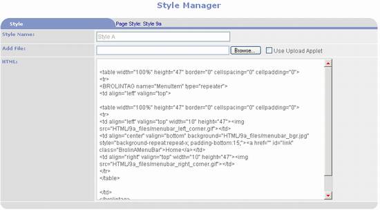
Use to add and update Styles. Styles are used to specify the design of web
pages and the various components displayed in web pages.
Style section:

- Style Name – use to enter a name for the
style.
- Width within
collection – this field is only displayed for component styles
designed for the main content section.
It is not applicable to any other section. It is used to specify the width of the
component as a percentage of the main content section’s width. Leave empty for 100%. Enter 50 to place two components per row
(i.e. 50% each), 33 to place three components per row (i.e. 25% each), or
25 to place four components per row (i.e. 25% each).
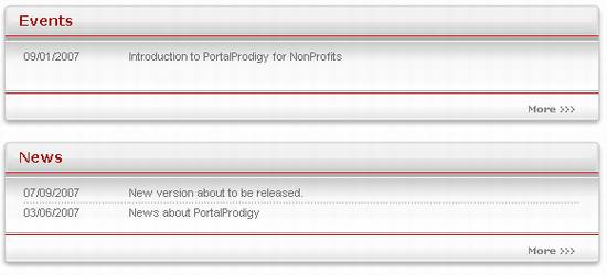
Example of components one per row (each set to 100%):

Example of components two per row (each set to 50%):

- Add File –
use to upload a style from an HTML file.
A copy of the file will be registered and stored in the Document
Resource Library. It can be checked
in and out of the library for editing and copying.
- File Name
– after a file has been uploaded the original file name is displayed here
along with the following options:
o
 - use to view or open the file. If your browser supports opening the file, it
will be opened in a new browser window.
o
 - use
to upload a new version of the file, replacing the previous version.
o
 - use to checkout the file for editing.
o
 - use
to open the file in the PORTALPRODIGY Document Editor.
o
 - use
to attach a file that already exists in the Document Resource Library. Either enter a Document ID into the text box
or click on the
  lookup icon
to use the Search For Documents feature to locate and select an existing Style.
- HTML – you
may paste the HTML for a style directly into this memo field in lieu of
uploading from a file.
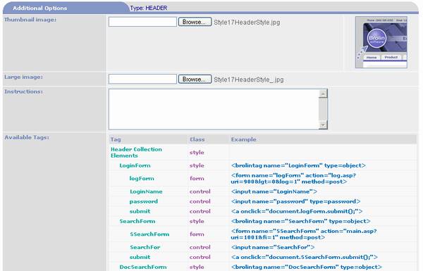
Additional Options section:

- Thumbnail
Image – use to load a thumbnail image of the Style. This image will be displayed on the
Style Selection page and in Page Manger when the Style is selected.
- Large Image
- use to load an enlarged image of the Style. This image will be viewable from the
Style Selection page.
- Instructions
– use to enter instructions regarding the use of the Style.
- Available Tags
– lists the THTML tags that are available for use in the Style for the
applicable component type.
Option buttons:
|

|
Saves the page. If
a file was selected it will be uploaded as part of the save process.
|
|

|
Save As is used to create a new Style by copying the current
Style. It will prompt for a name and
save the Style under the new name.
|
|

|
Opens Component Style Custom Values page which is used to
enter and upload custom values used in the Style.
|
|

|
Opens Component Style Verification page which is used to
verify sub-component styles found within the uploaded style. See the section of this Chapter titled
Component Style Verification Page for additional details.
|
|

|
Prints the page to the user’s local printer.
|
|

|
Closes the page and prompts to save the data.
|