Page Manager is used to configure page settings. Page settings control what is displayed on a
page and how it is displayed.
Page Settings section:
This section is used to configure the Page’s Settings Collection.

§
Inherit
From – used to select a collection to inherit settings from. Inherited settings can be individually
overridden by checking the Override checkbox. Inherit From offers the following
choices:
o
Site
Settings – select to inherit the active Site Settings Collection.
o
Page Type
Default Settings – select to inherit the active Page Type settings for the
applicable Page Type. Page Type Settings
are managed using Page Type Manager.
Note that this option is not always available.
o
Other
– select a collection from the list box.
Collections that you create are listed here.
To override an inherited setting make sure that you check the
Override checkbox after selecting a style; otherwise your change will be reset
to the inherited value.
§
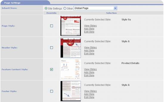
Page
Style – determines the general page layout and design. A thumbnail of the selected Page style is
displayed along with its name and the options View
Styles, Edit Style,
and Add Style. Use View
Styles to select a Style. It
opens the Style Selection page which displays the available Page Styles. PortalProdigy ships with a variety of
Standard Styles for you to choose from, plus you can create your own Custom
Styles. See the Style Selection section
of this chapter for a detailed explanation how to use the Style Selection
page. Edit
Style opens the selected style in Style Manager. Using Style Manager you can view and edit the
style’s code. See the Style Manger
section of this chapter for a detailed explanation of how to use the Style
Manager. Add Style opens the Style Manager in add new mode so you can
upload a new Custom Style. When you
select a different Page Style, the Header and Footer Styles are automatically
synchronized to match the selected Page Style.
§
Header
Style – determines the design and layout of the Header. Displays a thumbnail of the selected Header
style along with the options View Styles,
Edit Style, and Add Style.
These options work the same as for Page Style. Use View Styles to select a Header Style.
§
Feature Content
Style – determines the design and layout of the Feature Content
Section. Displays a thumbnail of the
selected Main Content style along with the options View Styles, Edit Style,
and Add Style. These options work the same as for Page
Style. Use View Styles to select
a Main Content Style.
§
Footer
Style – determines the design and layout of the Footer. Displays a thumbnail of the selected Footer
style along with the options View Styles,
Edit Style, and Add Style options. These options work the same as for Page
Style. Use View Styles to select
a Footer Style.

§
Color
Scheme – Use the list box to select a Color Scheme Collection. Color Schemes allow you to manage the colors
used on your website. The  button is used to create a new Color Scheme
Collection. The
  button is used to edit the selected Color
Scheme Collection. See the Color Manager
section of this Chapter for a detailed explanation of the Color Manager
page.
§
Header Collection
– use the list box to select a Header Collection. Header Collections allow you to manage the
components displayed in the page header.
Components include menus, search option, login option, etc. The  button is used to create a new Header
Collection. The
  button is used to edit the selected Header
Collection. See the Header Collection
Manager section of this Chapter for a detailed explanation of the Header
Collection Manager page.
§
Left Side
Bar Collection – if the Page Style you have selected contains a left side
bar, use this list box to select a Left Side Bar Collection. Left Side Bar Collections allow you to manage
the components displayed in the left side bar of the page. Components include menus, promotion inserts,
event inserts, news inserts, etc. The  button is used to create a new Left Side Bar
Collection. The
  button is used to edit the selected Left Side
Bar Collection. See the Side Bar
Collection Manager section of this Chapter for a detailed explanation of the
Side Bar Collection Manager page.
§
Right
Side Bar Collection – if the Page Style you have selected contains a right
side bar, use this list box to select a Right Side Bar Collection. Right Side Bar Collections allow you to
manage the components displayed in the right side bar of the page. Components include menus, promotion inserts,
event inserts, news inserts, etc. The  button is used to create a new Right Side Bar
Collection. The
  button is used to edit the selected Right Side
Bar Collection. See the Side Bar
Collection Manager section of this Chapter for a detailed explanation of the
Side Bar Collection Manager page.
§
Footer
Collection – use the list box to select a Footer Collection. Footer Collections allow you to manage the
components displayed in the page footer.
Components include menus, search option, login option, etc. The  button is used to create a new Header Collection. The
  button is used to edit the selected Header
Collection. See the Header Collection
Manager section of this Chapter for a detailed explanation of the Header Collection
Manager page.
Search Engine Settings section:

§
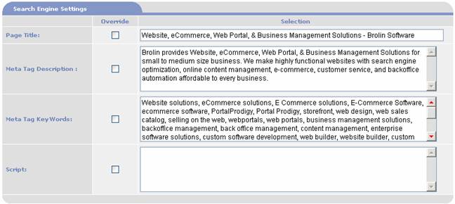
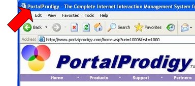
Page
Title – use to enter the Page Title for the Home page. The Page Title is displayed in the browsers
title bar. Page Titles play an important
role in search engine ranking.

§
Meta Tag Description – use to enter a
default Meta Description to be inserted in the Home page. Meta Descriptions are used by search engines
to index and rank web pages. They are
not visible to the user.
§
Meta Tag Keywords – use to enter default Meta
Keywords that will be inserted into your Home page. Meta Keywords are used by search engines to
index and rank web pages. They are not
visible to the user.
§
Script
– use to enter script that will be inserted into your home page. This can be a combination of HTML and Java
Script. This is typically used to enter
scripts for tracking purposes such as ad word tracking, traffic analysis, etc

§
Create
Landing Page – set to Yes to
create a landing page for each feature record that the page settings are
assigned to. For each record, a Landing
Page will be created in addition to a regular page. Landing Pages are pre-built (static) pages optimized
for search engines to increase the odds of getting indexed and to achieve
higher rankings. Landing pages use
several techniques to accomplish this including static pages, removal of all symbols
from URLs, placement of keywords in the URLs, and simple lightweight design. PortalProdigy
automatically builds a site map for Landing Pages called a Doorway Site
Map. You should create a visible link on
your home page to the Doorway Site Map.
The Doorway Site Map is listed as an option in Menu Item
Management. Menu Item Management is a
part of the Menu Builder feature. For
instructions how to use Menu Builder, see the chapter of this guide titled
Features Management Menu in Detail.
Landing Pages can play an important role in your overall search engine
strategy to drive more traffic to your website and increase the quality of the
traffic.
§
Landing
Page Name – this is used to create the URL for the Landing Page. Set to Auto
Generate to have PortalProdigy create the URL from information contained in
the record. E.g. for Product Item
records it uses the Product Name and ID as shown below. The following is an example of the portion of
the URL that is appended to your domain:
/StaticPages/Products/Canon_PowerShot_A710_IS_7.1MP_Digital_Camera_with__1005.htm
Set to Specify to
manually enter a value in the text box.
§
Landing
Page Style – determines the design and layout of the Landing Page. Displays a thumbnail of the selected Landing
Page style along with the options View
Styles, Edit Style,
and Add Style. These options work the same as for Page
Style. Use View Styles to select
a Landing Page Style.
Option buttons:
|

|
Saves the Home Page Collection.
|
|

|
Save the Home Page as a new collection. Prompts to enter a Home Page Collection
Name as follows:

|
|

|
Deletes the Page Collection.
|
|

|
Prints the page to the user’s local printer.
|
|

|
Displays an example page using the Page Collection.
|
|

|
Closes the page without saving or updating values.
|
|

|
Closes the page and prompts to save the data.
|